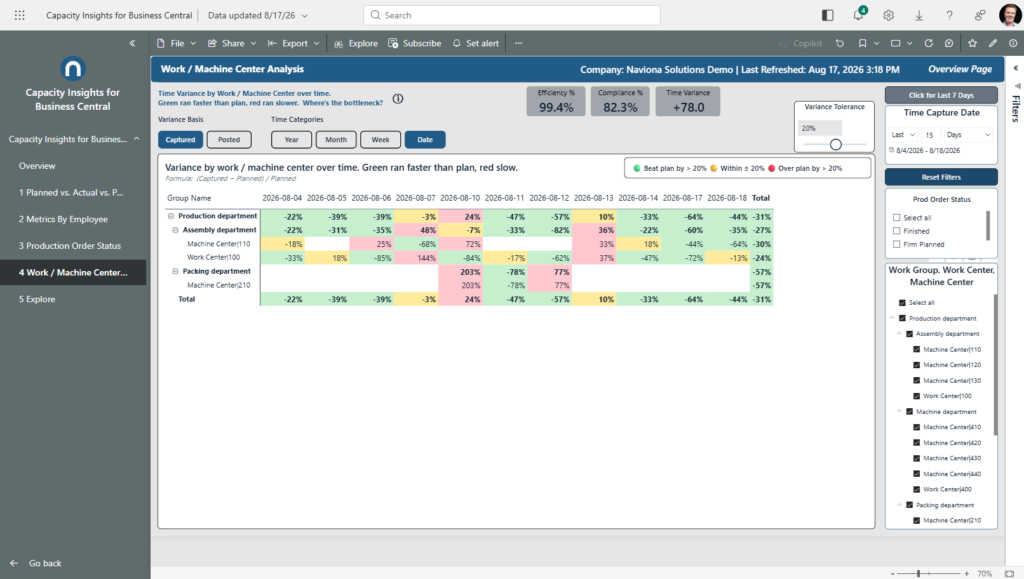
Time variance by work / machine center over time. Green beat the plan, red ran over. Where is the bottleneck?
What it shows
A heat map where each cell is a center’s time variance for that date: Captured variance is (Captured − Planned) ÷ Planned, or Posted variance when you switch the basis. Green means the center beat the plan (ran faster), red means it ran over, and yellow is on plan, within the tolerance band.
Slide Variance Tolerance to set how wide “on plan” is (default ±20%). A blank cell means the center was idle or had no comparable plan that day, so it isn’t judged — blank, never green. The KPI cards add context: Efficiency %, Compliance %, and Time Variance, which follows whichever basis is selected.
Use it to
- Find the bottleneck — centers that stay red across their row.
- Confirm which centers beat plan (green), and tune the tolerance to your shop’s definition of “on plan.”
- Switch the basis between Captured and Posted — floor performance vs. what actually got booked.
- Zoom into one department or center’s day-by-day trend.
How to use the page
- Switch Variance Basis (Captured / Posted) to change what the cells and the Time Variance KPI measure.
- Drag Variance Tolerance to widen or tighten the “on plan” band.
- Expand or collapse a department to move between summary and center detail.
- Use the slicers on the right to narrow by date or center.
Note. A blank cell is idle or unplanned time, not zero variance — it’s left unjudged (never green) so an untouched center doesn’t look like a win.